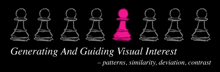
Visual interest – independent from what designers want to illustrate – is important to guide the viewers attention and is used in game design in a multitude of ways. It provides clarity and readability for gameplay situations, systems and storytelling. Let’s explore how visual interest is generated.
Interest in Games
We need to do a bit of terminology definition here first, since the term “interest” carries a lot of meanings, which are not relevant for this article here. When I mention interest, I’m not talking about what people find attractive. When someone is a big first person shooter fan, the sight of spectacular gun model protruding from the bottom of the screen will be interesting for that person. This is not it.
Interest is often also connected to complexity or richness of detail. Textured objects often are viewed as more interesting, than plain ones, since there simply is more to see. This is not it either.
In this case, interest describes a quality, that grabs the viewer’s attention and suggests to the viewer that something is relevant. Creators imbue certain elements – characters, objects, devices, creatures, places, details, user interface elements – with importance. They do this for their stories, for gameplay mechanics or for emotional impact. But making their audiences recognize the importance of those specific elements is another problem to solve. This is where visual interest comes in.
Deliberate distribution of visual interest is a key element to many forms of design, such as film making and interaction design. But most importantly in the creation of games – where usability, storytelling and esthetics come together – being able to make elements appear relevant for the player is vital.
Note how GUI elements are grouped together by virtue of being not part of the virtual space, how the enemy characters are visually grouped together by character design, how one enemy is distinct from group by the GUI element over his head and how easy it is to distinguish between environment objects and gameplay relevant assets.
Games in which the player has to navigate spaces need to guide the player in separating environment decoration from interactive elements. Shooters need to guide the player in evaluating targets, deciding which targets are more dangerous than others and guide in separating friend from foe. 2D platformers need to make solid platforms, deadly hazards and valuable collectibles more interesting than background elements. You get the idea.
The player needs to be able to understand, which elements in the game are worth being concerned with, which elements carry meaning. And designers do well in guiding the player through this evaluation. Game designers and artist can focus the interest of players and viewers on certain elements, on how elements relate to each other and to the player, how elements are grouped, special elements and how elements are changing.
There is no such thing as absolute interest, though. Nothing is ever interesting on it’s own. Interest emerges when something is viewed in relation to something else. Without context a thing is always just present. Objects are only big in relation to something smaller. There is only a foreground, when there is a background.
This relation can come from juxtaposition – when elements are placed next to each other. It can come from being part of a sequence – where elements appear one after the other. Or it can come from the viewer connecting what he or she sees with images in his or her own memory and biases. This means creators can either put the related pieces into the game or image themselves, or they can bank on their audience to bring the related information with them as part of their own perspective.
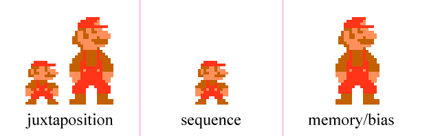
From left to right: Mario juxtaposed with his bigger self. Mario changing size in sequence. And finally just the bigger Mario, which we recognize as the bigger one, because we learned before that he is the bigger one.
In order to make an element interesting, designers either need to establish a context in which the element has relevance or they need to exploit their audience’s viewing habits, biases and cultural visual language. Preferably both. Exploiting biases needs extensive research and a clearly defined target audience. We need to understand what our target audience expects, what stands out to them, what their visual language is and how we can contrast our designs to those properties.
Creating interest through context on the other hand needs structure.
Interest
Through
Structure
To create context we need to play with patterns and distinctions. Patterns and distinctions are mandatory to guide the viewers interest. The viewer needs to understand, which elements belong to each other, what the defaults are and then we can present irregularities and make things stand out. Without patterns, information is just noise.
It is common to recommend working with contrasts to generate visual interests – bright colors versus dull colors, complementary colors, light versus dark colors (values), round shapes versus angular shapes and so forth. All of this is true but only half of what we need to consider. Just throwing contrasting properties together without structure makes everything rich and colorful but does not guide interest.
If contrasts are to low, elements are no longer significantly distinguishable, but if everything is pumped up with high contrast values, without low-contrast elements to compare them to, it gets cluttered and noisy. Unique qualities need to be contrasted with patterns, always, no matter what kind of properties are used to illustrate that contrast.
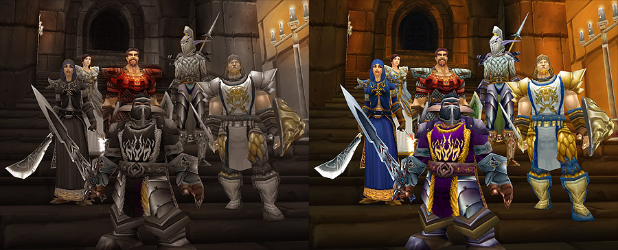
Left: WoW screenshot with muted colors, focussing attention to the red character in the center, separating the red character from the group, therefore bringing the rest of the group closer together, establishing a hierarchy. Right: equally colorful characters, providing a rich visual, but lacking guidance.
Examples
Let’s go through various examples of how noise, patterns and distinctions guide interest. For this, I use chess pieces to illustrate various ways of structuring elements in an abstract way. These structures can then be applied to anything, that can appear on screen in a game. Character line-ups, design elements on one character, environment, GUI, props and whatnot. I also added a few case studies to illustrate how you can basically project any content on those structures and make it relevant by doing so.
noise
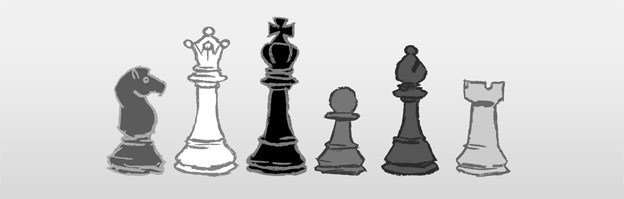
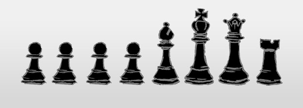
This set of pieces is a random mix of shapes and shades. Sure, any viewer can attribute more relevance to one piece or another, based on personal bias – maybe you are a big fan of horses. But the interest is not guided. From a design standpoint, there is nothing suggesting that one piece is more relevant then others or that this collection of pieces has relevance.
So there is a lot of information here, but no structure. This is noise.
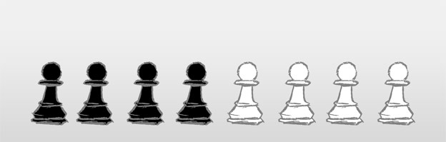
uniformity
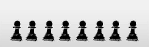
This is the as basic as it gets with patterns. Like with noise, no individual stands out. But we now have a context to view them in. They belong to each other, they are the same, they are instances of the same entity. All that we learn about one of them, applies to all of them. We can transfer the relevance of the one of them to others.

To be part of a uniform pattern it is not necessary to be totally visually identical. As longs as the differences are not significant, as long as elements are recognized as the same, the effect applies. Like the collection of gems above, which all end up being similar loot items without significant differences. In comparison, in Bejeweled Blitz differently colored gems are much more significant.
distinctive patterns
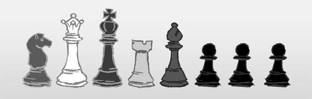
When noise is the norm, a pattern stands out. In comparison to noise, the pattern itself becomes a relevant element. Order and uniformity have relevance when juxtaposed with noise, chaos and individuality. Note how the three pawns are connected, how the whole line-up is now divided into two groups with different qualities.
The noisy group is now a pattern itself. Not because they are similar, but simply by virtue of not being part of the uniform pattern.

The strong uniformity of the Storm Troopers makes the special members of the empire stand out even more and makes the rag tag team of rebel heroes feel even more diverse.
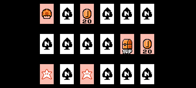
In a game of pairs, the goal is to dig for distinctive patterns in a large randomized collection of cards.
shared properties

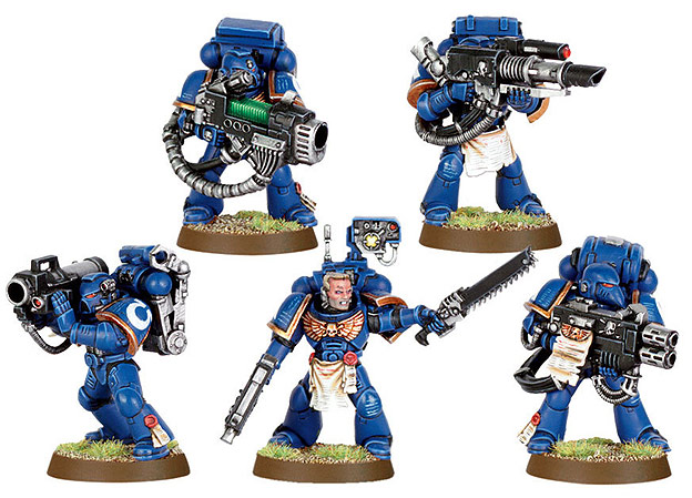
This is by far the most popular of the listed structures here. The idea is either to have individual elements and add one unifying detail or to start with a uniform group and then work out the individual properties of the pieces.
Note how all pieces belong together but are all also individuals. This setup is so popular because it allows to generate interest by presenting a group and also by presenting all variable number of individual pieces with the distinguishing features contrasting with the unifying features.
The fact that all pieces belong to one unifying pattern has significance on its own but also makes the individual qualities stand out more, because the individual qualities contrast with the pattern. The individual property is what generates the most interest here, since the shared properties become a standard or default. This often ends up reducing the pieces to each piece’s exclusive feature.
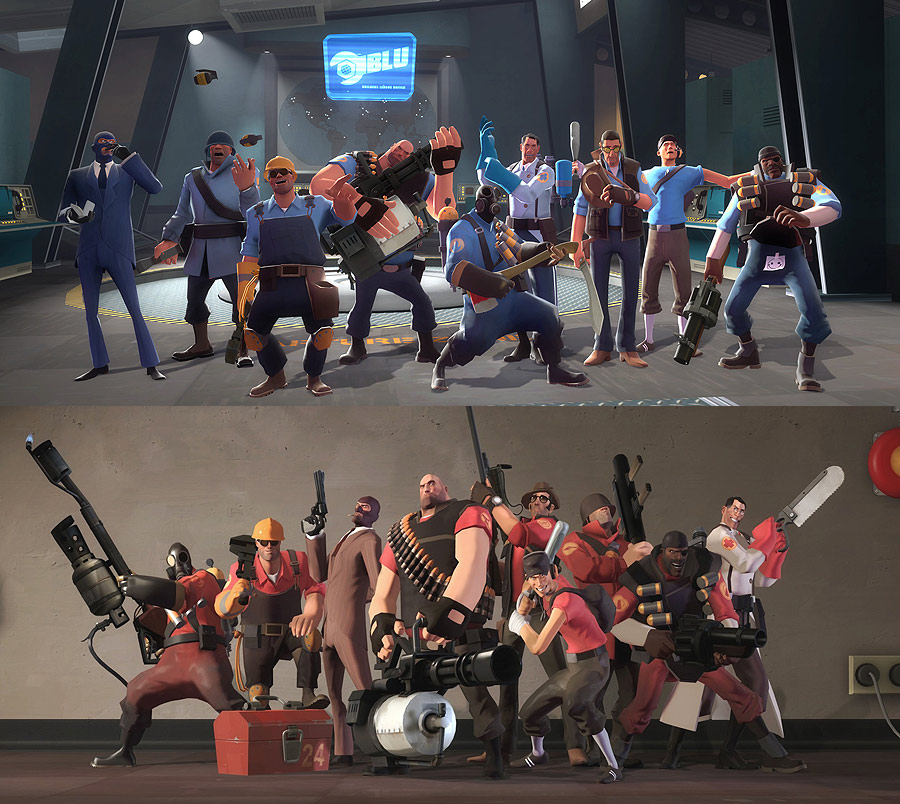
Note how each character’s outfit is a pattern of grays and muted browns, to not take attention away from the color coding. Blue elements and red elements are used to group the individual character classes into two teams and to connect them to each team’s bases.

The Turtles share the majority of design elements, with the separating elements being in the minority. The fact, that the color coding is always on the head bandana, makes the color coding more obvious. Colors and weapons are the defining features of each character, being a ninja turtle is the default pattern.
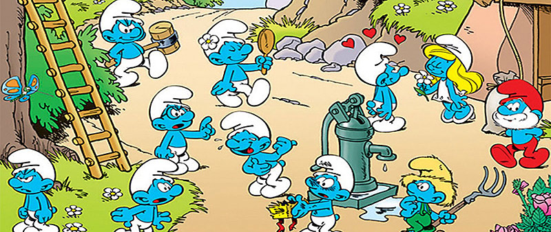
Being blue and small and having a hat is a default, the way each Smurf breaks from that pattern makes them special but also reduces them to that defining factor. So even being the one Smurf who is female and feminin becomes an exclusive feature and lacking other noteworthy qualities ends up reducing a character like Smurfette to the concept of femininity and womanhood.
patterns with deviating elements
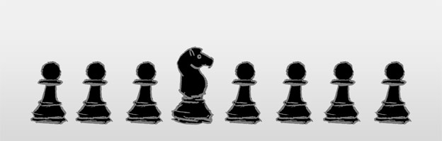
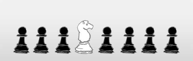
When a pattern is established, deviations stand out and suggest relevance. The odd piece still is part of the same pattern, but one exclusive quality makes it more interesting, than the others. Note how the knight feels like part of the group, but still is an individual piece, worthy of individual consideration. The knight is not only different, it is special. A hierarchy is suggested.
Also note how uniform the pawns appear, now that we have a deviating piece. And finally note how the deviating piece now cuts the pawn into two groups, because of the way the pieces are arranged.
To achieve this effect it is up to the creators to choose, how one element deviates from the pattern – this depends on whatever the designers want to articulate – but it is necessary to keep the odd element connected to the pattern by keeping some qualities similar. The uniformity of the rest of the group enhances what makes the odd piece distinct even more, reducing the piece to its distinguishing factor even stronger, than previous arrangements.
Note how the Space Marine deviating from the pattern – the one without helmet – appears to be of more importance than the others.
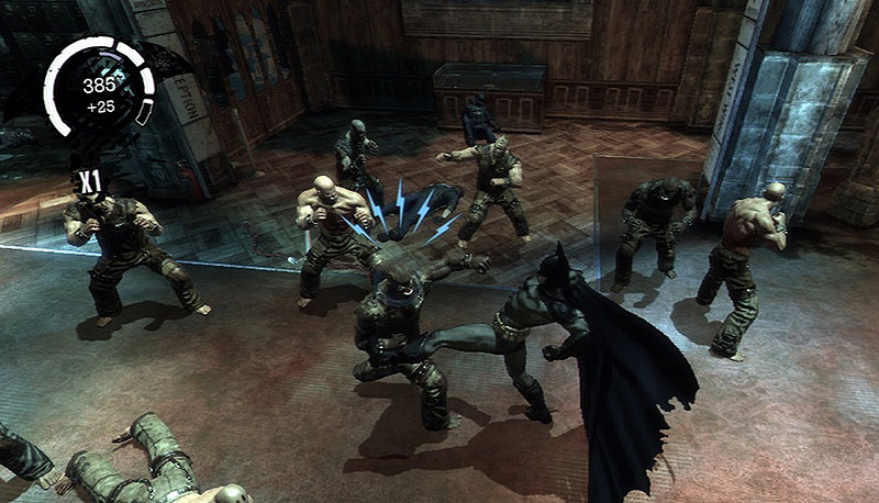
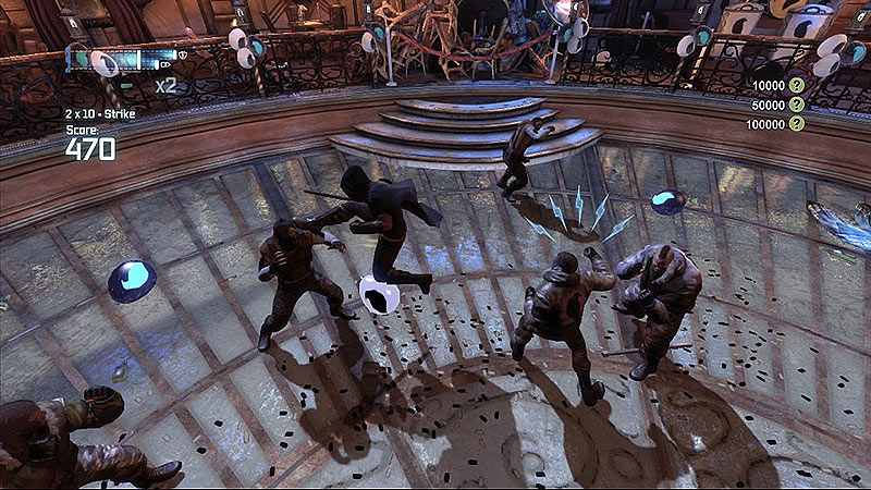
Making elements deviate from the pattern can also be done dynamically. Note how the “lightning” user interface element hovering over one of the enemies now makes this enemy deviate from the rest. The design overall keeps the group together, but the highlighted fighter demands special attention now. This deviation is of course also supported by the combat animations.
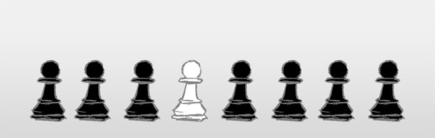
patterns and outsiders
If the odd piece has only minor or no overlapping qualities with the rest of the pattern, it is completely separated from it. Note how the pawns are a group here and how distinctively the knight is not one of them.
The threshold for when the odd piece is so distinct, that it no longer part of the rest of the pattern is arbitrary. It is always possible to spot similarities and then judge that a piece, while different, still belongs to the group. It depends on what is considered a minor or major similarity/overlapping quality.
The pattern from which the odd piece is separate does not need to be uniform. Having a recognizable pattern and a lack of overlapping qualities is enough.
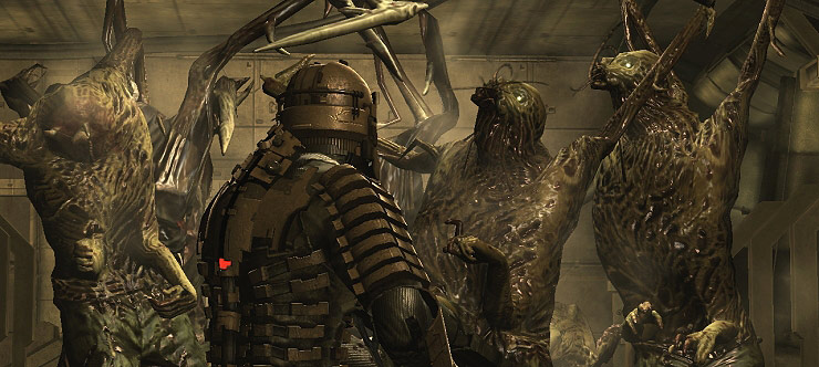
The design of Isaac Clarke makes him not appear as a variation of the Necromorph enemies, his space suit and faceless appearance make him clearly not part of that group, but put him in odds with them.
nesting patterns
You can go pretty wild with the combinations and layers of patterns, noise and distinguishing features. Note above how all pieces are black, but are separated into two distinct patterns themselves. Note below how the parent pattern makes every piece equal in one aspect, but how the sub-patterns separate the pieces into two distinct factions.

In Left4Dead2 we have to groups fighting each other, humans versus infected. Within the infected group – signified by a pattern of special skin colors, empty eyes and necrosis – there are sub patterns to separate common infected from uncommon infected and special infected.
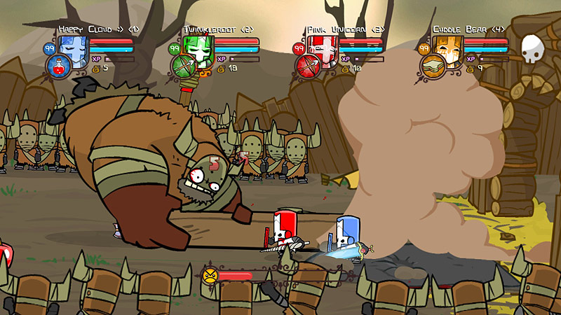
Patterns and distinctions help us make sense of this scene. The pattern of the templar-like armor and helmet for the heroes and the fact, that only heroes get primary colors, contrasted with the barbaric clothing and dull color scheme for the enemies, helps us separate friend from foe. But even within those groups we have patterns and distinctions, separating each player and separating regular enemy foot soldiers from the big boss character. There even are patterns to connect the GUI elements with the player characters by applying shared color coding.
Wrapping up:
In order to generate interest, it’s helpful to…
- – go for clearly distinct design elements or clearly similar design elements. Avoid elements, that are just kind of different or kind of alike.
- – avoid noise at all cost. Always have structure.
- – use similar design elements to establish patterns.
- – make the similar elements of each pattern exclusive to that pattern, in order to make patterns distinguishable from one another.
- – use contrasting elements to establish deviations within a pattern or to fully separate entities from the pattern.
- – work in additional distinguishing elements or shared elements to create sub-patterns or merge patterns into larger ones.
- – use patterns, deviation and separation to help the player recognize groups, unique elements, variations of elements within groups, changes of elements, relations, sequences, priorities.
As you can see, there are plenty of ways of creating contrast between patterns and distinction in order to generate interest. And yes, one could come up with more abstract examples here, but I hope you got enough to get behind the concept here.
Please leave suggestions, helpful links and questions in the comments. Thanks


hey.
yea