This is a multipart article on color design for games. It is aimed at game designers and game artists alike and focusses on how to use color when crafting player experiences.
Check the color theory readlist tag for all 4 parts of this series and the color design tag for all things games and color.
Definitions are mostly custom made by me, since most color design literature is specialized for other creative fields – such as painting, print, screen design – and not suited for what we are going to talk about here. However, the following definitions have proven to be quite effective in the field.
Okay, we dig into part 1 now. Let’s talk colors, contrasts, layout, canvas, objects:
Item 001 – Color design as it relates to other art forms:
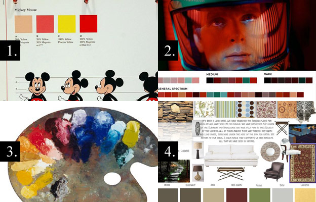
1.Mickey Mouse model sheet ©Disney / 2. 2001 A Space Odyssey palette via / 3. artist’s oil color palette / 4. interior design concept via
In non-interactive media, color palettes serve the purpose of creating images. It’s about creating visual interest, sometimes symbolic messages, triggering emotional responses, to make images readable and recognizable. Many of these design goals apply to games as well.
We get even more overlap to games with fields like interior design, industrial design or fashion. Real life spaces and objects need to be aesthetically pleasing and functional, but also need to be used by people.
All of these disciplines provide valuable practices and methods for game designers to create captivating and functional color design. And there is plenty of literature on those subjects. Especially in regards to color in images – painting, cinematography and photography – you should have had access to some basic education in school already.
However when it comes to game design as a discipline we have still a lot to explore as to what language tools we actually have at our disposal and how to use them in games effectively. So this is what this article is mainly trying to focussing on.
Item 002 – Color design as it relates to game design:
Okay, here is what we do. We wont ignore traditional or non-interactive color design for this article, but we will focus on very game design specific goals. For example…
Virtual spaces:
– generating spatial awareness and enabling navigation in virtual environments
– generating physical awareness for objects
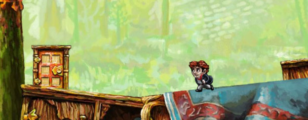
Braid
Rules and mechanics:
– articulating group affiliations and other relationships between game entities
– enabling operation of machines and devices as well as other interfaces
– labelling game entities in relation to their function in the game rules and mechanics
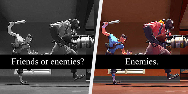
Team Fortress 2
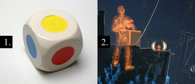
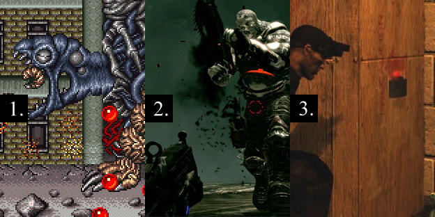
1. color dice via / 2. Batman – Arkham City
Emotion:
– facilitating the player’s emotional state in relation to different gameplay simulations
– instant emotional feedback, such as the symbolizing of pain
– creation of an emotional framework for player activities
Silent Hill series uses texture switches to cleverly create dirty icky color schemes that are designed to make the player uncomfortable and create an atmosphere of danger and decay. …perfect for survival horror.
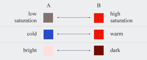
Item 003 – A helpful definition of color:
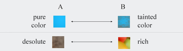
There are many definitions of color out there. Depending on the context in which the color is used it may or may not contain black and white as colors, may or may not consider saturation and luminosity. Some systems catalogue colors based on how they are mixed as paint, some use complex numbers and codes, some use terminology like “strawberry red” and “egg white”…
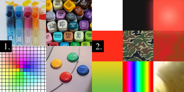
1. colors in the “technical” sense / 2. colors in the conceptual sense
In accordance with the stated game design goals above I’d like to expand on those systems and blow the catalogue of colors open to all concepts of color if they can be colloquially read and named. The idea is to understand colors not as technical properties – such as the property of a pixel or a pen or a piece of cloth – but as concepts on their own.
It’s a semiotic approach to color. Color as language. So when asking a person “what color is this object” any answer you get is part of our color catalogue, even though it might not be found in any technical definition of color. An object can be red, bright red, dark red, blood red, dirty red, it’s colors can be described as muddy, can be golden, black, camouflage colored, or rainbow colored, can have a warm color… and more.
I have yet to find any technical catalogue/system/definition to include color as we humans use it when talking to each other. So I think it’s a bit pointless trying to fit in and let’s just roll with what humans do.
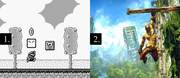
1. Super Mario Land 2 / 2. Enslaved
It’s important that we accept what works as language and not retreat into definitions from literature or technology. A GameBoy game is confined to black and white, an Xbox game can do much more. However, black and white cannot mean “no color” or we are blocking ourselves from using color effectively. The black and white Mushroom Kingdom here is just as much a color scheme as the vibrant environments of Enslaved are.
Item 004 – Control through contrast:
Once we open ourselves up to color as meaning – not a technical property – we can combine colors an make them relate to each other to control what we say with color. And we need to. The ways people read color is usually pretty subjective.
The first thing we need to pull off is that the player even gives our designated color cues the necessary attention. This means our key colors need to stand out from the rest of the screen content. Secondly we need to guide the player in attributing some sort of meaning or value to the colors in question, which is usually a matter of relations.
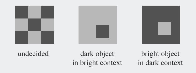
Colors are most meaningful in contrast with opposite meanings. A dark object is significantly dark in a bright environment. A dirty object is significantly dirty if the object was squeaky clean a moment ago. If color A is not contrasted with color B, color A is likely to be overlooked and to not convey the desired meaning to player.
Contrast lives on simplicity and extremes. The more colors and shades you use, the less present a contrast is. If you want to accomplish clarity with your contrasts, it’s important to make the contrasting colors differ strongly, to remove noise and avoid gradients if you want your colors to stand out.
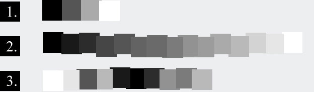
Note above how clearly black, dark grey, light grey and white are readable in row 1 and how the readability of those colors decreases with added increments (2) and finally noise (3).
Item 005 – Color layout:
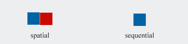
Layout is the process or result of arranging contrasting colors. Layout can happen spatially – meaning that the two or more contrasting colors are all visible at the same time and are distributed in the available space. It can also be done sequentially – meaning the contrasting colors occupy the same space but appear in sequence or alternate. You can of course do both together.
Effective layout demands another necessary design decision to make contrasts click: weight distribution. When we have two colors in contrast with each other, we still miss information about which color is providing the context for the other and that’s where weight comes in. Weight is achieved by allocating significantly more space/time to one color than to the other.
The two fighting game screenshots below show how weight and contrast affects readability and context of colored objects. Street Fighter 4 suffers from a lot of color noise and a lack of discernable contrasts. The characters and the background each have no distinctively dominating colors. And what makes for a really pretty and colorful image is – from a game design standpoint – really poor color layout. See how the reduced detail version below no longer contains any readable information about the geography of the scene.
Compare this to Nidhogg. While the game is arguably not as traditionally pretty, the color layout is much more gameplay focussed and supports helping the player understand what’s going on. Even in the pixelated edit of the screenshot we can still see the slim corridor and a yellow entity facing off with an orange one. We can also see that there is much more yellow related elements on screen than orange.
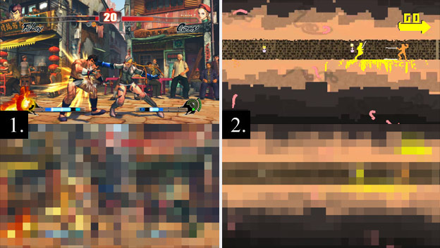
1. Street Fighter 4 / 2. Nidhogg
Weirdly enough the color with less allocated space/time is usually the one the audience is most interested in. One would think the more space a color has the more importance it suggests. But we are wired to identify objects in spaces. And that’s why the almost monochrome background in Nidhogg gets read as, well, background and the tiny strongly colored blips – yellow and orange – are read as objects.
Take an empty piece of paper and a marker and doodle a tiny thing in the middle of the paper. Even though there is massively more white on that piece of paper, the tiny doodle is what is demanding our attention.
For my work – when I plan my color layouts or when I examine other people’s work – I’d like to separate each possible image into two layers: the canvas layer and the object layer. The object layer includes all the relevant color objects – those we want the audience to recognize and think about, the doodle – the canvas layer provides the context from which the objects can stand out in contrast, the paper.
Objects on the object layer can be in contrast with each other as well, but both need to stand out from whatever color scheme fills the canvas.
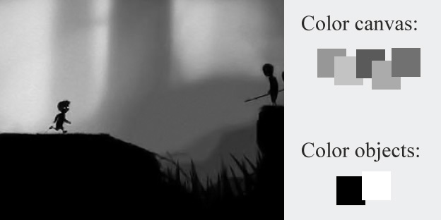
Limbo
This principle applies to individual game assets as well as full screen compositions. See this boss enemy from Vanquish for example. The canvas of this assets is all the grey metal plating and the object layer is all the glowing orange target spots. You can draw a doodle on a white t-shirt as well. It’s important that you don’t equate canvas with background, since even game assets are a canvas to “paint” your color layout onto.
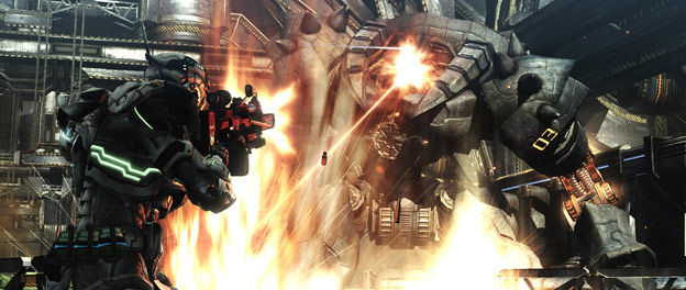
vanquish
Below are a few examples of sequential layout. The bosses in Super Contra flash white whenever you hit something that hurts them, allowing players to quickly identify weak spots. The crosshairs of Gears Of War switches from white to red, confirming successful aim – a very popular mechanic in most console shooters. And last but not least, wall mines in Splinter Cell have a bright red LED when armed which switches to green when the mine is disabled.
Super Contra, Gears of War series, Splinter Cell series.
Item 006 – Summary:
Okay, let’s go through all definitions from bottom to top:
– Color layout means the distribution of colors in scenes, images and on individual game assets, such as 3D models, sprites and GUI elements.
– The distributed colors are separated in two groups: color objects are the colored elements that the players should give their attention to and attribute meaning to. Color canvases on the other hand are the contexts in which color objects stand out and can have meaning through contrast.
– Contrast is present when two colors have opposite values or meanings and are arranged together in a color layout.
– Colors in this case oes beyond any technical definition of color and must include colloquial definitions of color as use in verbal language as well.
As a final example for this lesson, let’s have a look at the early court house sequence in Arkham City. The game offers two visual modes to look at the environments and objects in it. Two color layouts for each scene basically. One is the default look which is more about aesthetic priorities than readability. Lighting and textures are delicate and noisy, color schemes are muted but atmospheric. This is super pleasing to the eye and supports narrative goals but it could use a bit more clarity and contrast for gameplay reasons.
This is why the developers installed detective vision. The vision creates a blackish blueish canvas with little to no textures and very reduced details. The canvas is really really dark so it contrasts well with the newly highlighted bright color objects – such as doors, enemies and NPCs. Even amongst the objects contrast is used to separate enemies with firearms from melee enemies with a strong blue versus orange contrast.
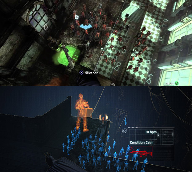
Batman – Arkham City
Okay, colors, contrasts, layout, canvas, objects… got it? If you got questions and suggestion, please hit the comments with all your might.
Part 2 is tackling using color as identifiers for game objects and connecting them to rules and mechanics.
Part 3 is about worldbuilding with color.
Part 4 is addressing design for people with color vision impairment.
…just so you know what to expect the next couple of days.


Excellent article.
It will help me a lot.
Why there is no Part 3 and 4?
Awesome Article!